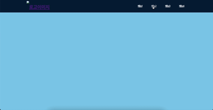
초간단 상단 고정 헤더 + 섹션 이동 레이아웃 ❣️
position: fixed를 사용하면 해당 영역을 원하는 위치에 고정시킬 수 있고, 물론 스크롤 할 때에도 고정이 된다.
여기에 각 메뉴 태그와 이동을 원하는 섹션 id를 연결시키면 자바스크립트를 사용하지 않아도 자연스러운 섹션 이동을 할 수 있다.
[HTML]
<header>
  <div>
    <h1 class="logo"><a href="./"><img src="" alt="로고이미지" /><a></h1>
    <ul class="gnb">
      <li><a href="#1">메뉴1</a></li>
      <li><a href="#2">메뉴2</a></li>
      <li><a href="#3">메뉴3</a></li>
      <li><a href="#4">메뉴4</a></li>
    </ul>
  </div>
</header>

<div class="mainContent">
  <div id="1" style="height: 700px; background: pink;"></div>
  <div id="2" style="height: 700px; background: yellow;"></div>
  <div id="3" style="height: 700px; background: greenyellow;"></div>
  <div id="4" style="height: 700px; background: skyblue;"></div>
</div>
[CSS]
/* 초기화 */
* {
  margin: 0;
  padding: 0;
  box-sizing: border-box;
}
html {
  scroll-behavior: smooth;
}
ul, li {
  list-style: none;
}


header {
  position: fixed;
  top: 0;
  left: 0;
  right: 0;
  height: 85px;
  line-height: 85px;
  z-index: 100;
  background-color: #071d39;
}

header > div {
  display: flex;
  justify-content: space-between;
  align-items: center;
  width: 75%;
  margin: 0 auto;
}

header .logo {
  height: 70px;
}

header .logo img {
  display: block;
  height: 100%;
}

header .gnb {
  display: flex;
  gap: 30px;
}

/* 메뉴 스타일 */
header .gnb > li a {
  padding: 15px;
  font-size: 17px;
  font-weight: bold;
  letter-spacing: -1.5px;
  color: #fff;
}

/* 메뉴 리스트 마우스 오버 효과 */
header .gnb > li a:hover {
  color: #ccc; transition: all .2s linear;
}

.mainContent {
  /* 헤더 높이와 동일하게 설정 */
  margin-top: 85px;
}
댓글